Stacktile
Make your DevOps
stack come alive.

- Roberto Simões (Lead Designer)
- Dr. Dan Levin (CEO)
- Michael Martinides (COO)
- Fabian Schaffert (Software Engineer)
- Marco Canini, Ph.D. (Advisor)
Feel the Stack
Project Background
Stacktile helps development teams understand DevOps tools and techniques and quickly implement them into production. Furthermore, its web app allows software companies to provide interactive documentation to prospective customers.
I was hired as a Product Designer. However, before designing their app, I needed to work on the company's branding, which required a brand strategy and visual guidelines. I also designed their website and marketing materials.
* Stacktile was acquired but still provides "Monitor in a Box."
Creative Process
The life of a DevOps is basically looking at a black, white, and green screen 😩. They use super technical jargon, and to be honest, it's a very dry job.
To stand out among DevOps tools like AWS, the Stacktile brand voice should be fun, light, and smart but still polite, descriptive, and technical.

Give me some stack, Jack!
All visual language is derived from the pun "give slack / give stack." Nobody wants to be treated poorly, right?
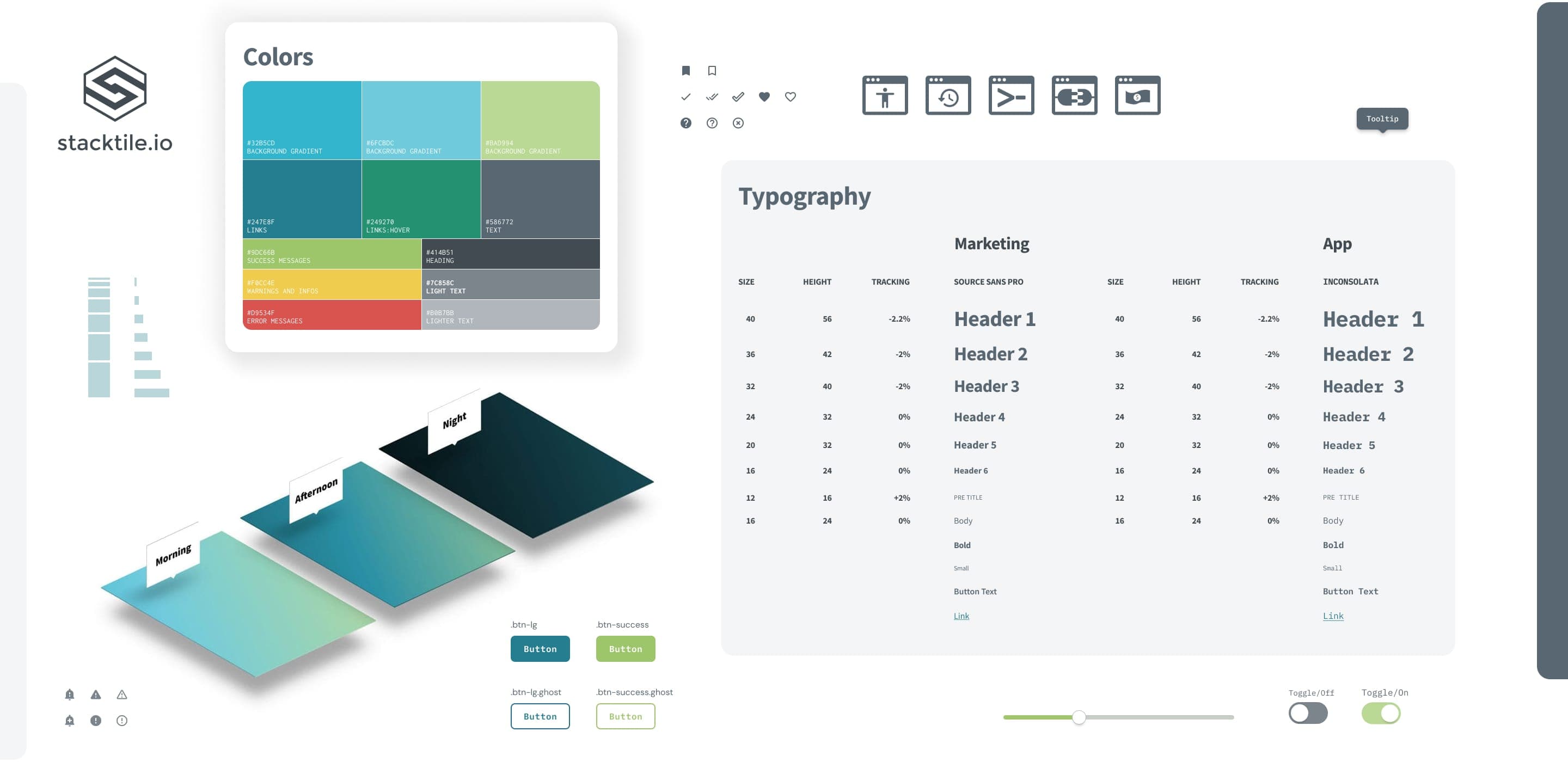
Colors
As the brand has to be fun and light but still technical, I chose blue and green, two of the most common colors in the development industry.
#32b5cd
#6fcbdc
#bad994
#247e8f
#249270
#586772
#9dc66b
#f0cc4e
#d9534f
#414b51
#7c858c
#b0b7bb
I designed backgrounds for each period, morning, afternoon, and evening, to create a unique feeling for the brand.

Typography
A terminal window is the primary tool used by DevOps. Monospace is the most common typeface used in these interfaces. Therefore, Inconsolata felt the right choice. Source Sans Pro was elected to break Inconsolata's boredom.
Logo
I mainly changed the typeface, which was very sharp, like the symbol, and stylized the Source Sans Semibold.
Design System
While creating the brand identity, I also documented all interface elements; the next step was to adjust everything to the new design and document all visual decisions in a design system.
Web App UX/UI
First, I reviewed the Piwik analytics data and implemented Hotjar to understand their users' behavior. Then, I created questionnaires to interview some users and designed user stories and journeys.
I prototyped the app directly in HTML, CSS, and JS instead of designing the screens using Sketch to speed up the engineering handoff.
After redesigning the app, I returned to a typical UI/UX workflow. Designing wireframes in Sketch and handing them to myself to implement in the app using Github branches.

Websites
I designed three landing pages for the official launch to test which would convert better. Version #3 (screenshot below) drove 67% more signups.
Stacktile also offers an open-source website monitoring technology. I also A / B tested two different landing pages, and the one below converted 22% more signups.